Project Info
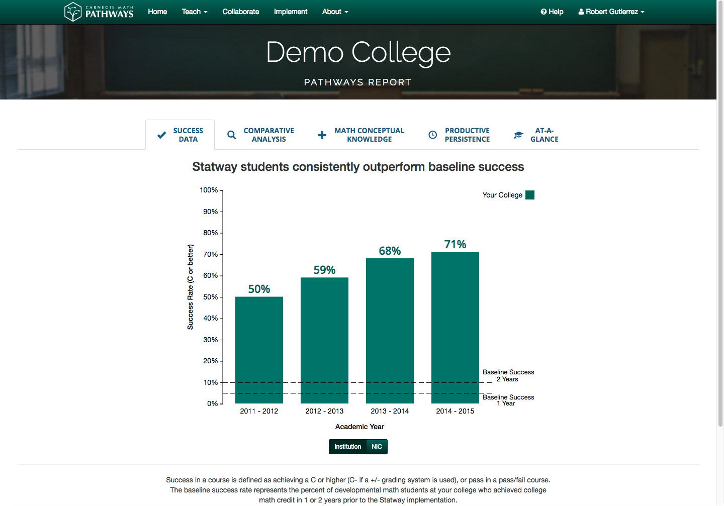
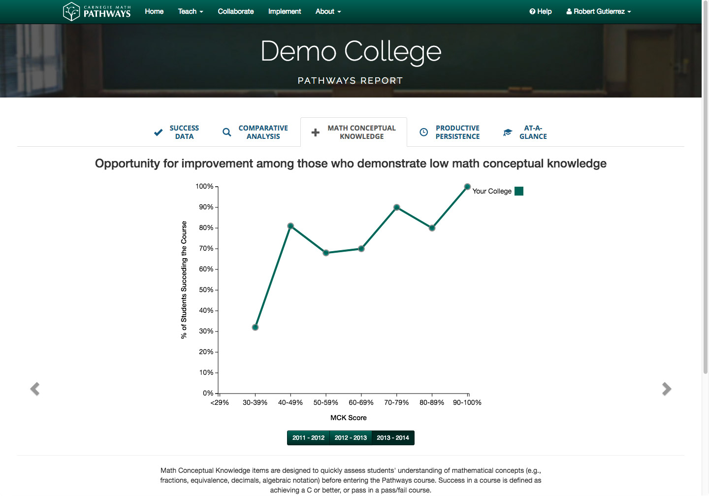
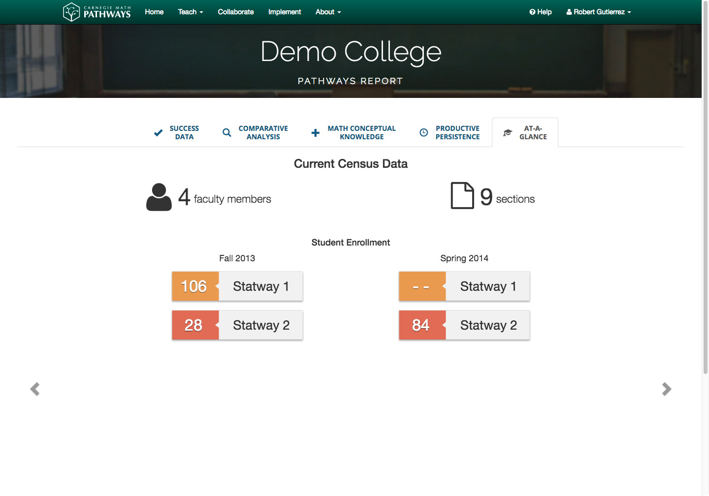
An annual report generated for each college involved in the Carnegie Math Pathways program. Pulls data from Google Datastore, our survey tool via API, Salesforce, and Google Bigquery. Graphs generated with d3.
Backend: Google App Engine Python webapp2 jinja2 Google Datastore Google Bigquery Salesforce
Frontend: Bootstrap d3 FontAwesome Photoshop
Project Description
The Carnegie Math Pathways program at Carnegie is a set of developmental math courses, combined with teaching resources for faculty and professional development through improvement science. Faculty teach these developmental math courses, and data is collected on the students who participate in them (grades, survey responses, etc.). In order for faculty members to improve their teaching, we use some of the student data to create reports for them. Faculty use these reports to find out what went well and what they can improve on for their next class. In addition to this, deans and other administrators want to know how their faculty are doing collectively; they want to see an institutional-level report. So every year, we would create these institutional reports for the administrators, usually through some combination of Excel, Word, and Powerpoint. That, combined with the extensive "data wrangling" that needed to happen, meant these reports would take months to make. Eventually we decided we needed an automated solution, so that's where I came in.
First, I analyzed the old reports and interviewed our analytics team on what sorts of data/graphs/diagrams we wanted to present. Once I had that in mind, I designed a layout for the report, which took advantage of Bootstrap tabs to save on vertical space. Then I had to determine the sources of data and how to transform the data into a structure that I could feed into d3 and make graphs. Once the graphs were done, we QA'd the reports and I made various small design updates, like colors, font size, typos, etc.
The first iteration of the new institutional reports went live in July 2015. They've since undergone updates to increase the automation, add and remove graphs, and change wording.
Backend
Reports exist within our Pathways Portal application, which serves the students and faculty involved in Pathways. Like most of the other applications we made at Carnegie, the Pathways Portal is written in Python using the Google App Engine framework. The code for the institutional reports was added to the Pathways Portal as it already contained a reporting system.
In the first iteration, data was pulled from static CSVs placed in the project itself. This was because the data wrangling process took longer than expected and I ran out of time. On the next iteration, the data was uploaded to Google Bigquery by our analytics team. The code was then modified to pull from Bigquery instead. This greatly improved the process because it allowed our analytics team to upload new data at their own pace; my work was no longer blocked by the data wrangling.
Frontend
The frontend of the application is a simple Bootstrap interface with lots of d3 and some extra jQuery code. d3 is used to generate all the graphs. Extra jQuery code was written to handle extra data visualization functions, such as showing/hiding certain data from graphs.
Design Decisions
Because these reports are built into the Pathways Portal application, it utilizes Bootstrap by default. Bootstrap has lot of built-in components that helped with the design of this, such as tabs, button groups, and popovers. I chose d3 as the data visualization library because it is one of the most popular, has extensive documentation, and has the capability to render many types of visualizations.


