Project Info
An online dashboard for school administrators and researchers to view reports based on survey data from their schools.
Backend: Google App Engine Python webapp2 jinja2 Google Datastore
Frontend: React Bootstrap d3
Project Description
A more in-depth walkthrough of this project can be found here: Project Deep Dive — Network Health Survey Reports.
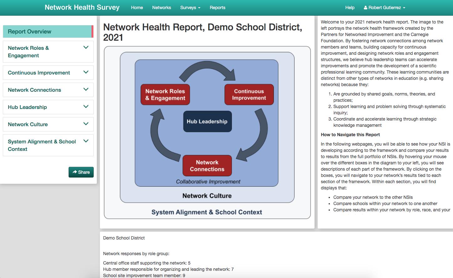
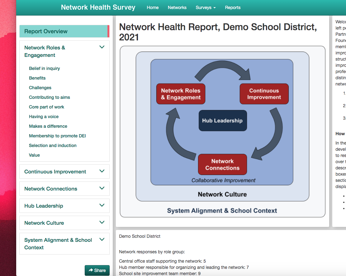
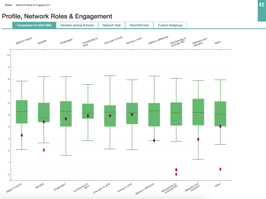
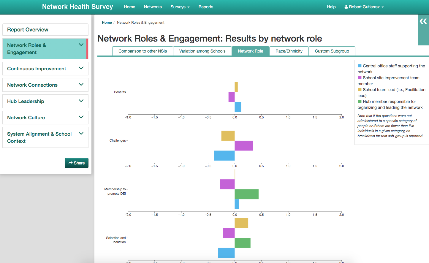
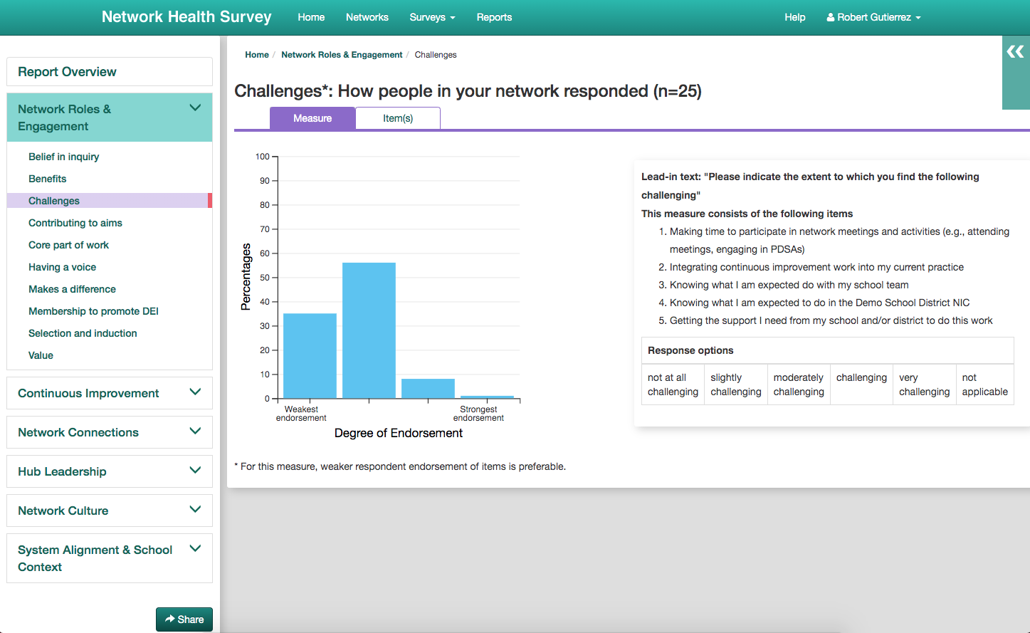
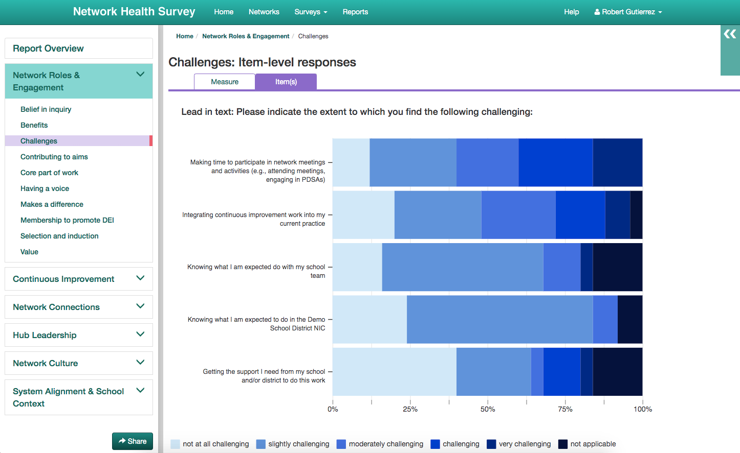
The objective of this project was create an online dashboard for school administrators and researchers to view reports based on survey data from their schools. These data were aggregated, analyzed, and exported to be fed into various visualizations, and these visualizations would be organized based on "constructs" and "measures", i.e. groups of questions. Each construct page also included related data such as Ns (number of responses to the questions), the list of possible responses to the questions, as well as some information on how to interpret the visualizations.
Report generation was semi-automated, leaving the data analysis and computation largely a manual process. A workflow was initialized which aggregated survey data by school and sent it to our analytics team. Once data had been analyzed and transformed into a programatically-friendly schema, it was ingested into our data warehouse. From there, the workflow because automated once more, transforming the data from our data warehouse into JSON where it could be read by the report app. Then one final look-over by our analysts before the report was marked as "ready to view".
While the construction of the Network Health Survey itself was a core part of this work and an obvious prerequisite, work on the survey happened separately, before work on the report app had started. This project had a tight five-month deadline. Four sprints were dedicated to research, planning, and scaffolding, with the rest of the time dedicated to development, followed by two sprints of testing, bug fixes, and final enhancements.
Backend
How would we gather the survey data, which was hosted in a separate survey application (which we call the Survey Tool) and database? How would we reformat the data and hand it off to our analytics team? How would they give the data back to us after analysis? And how would we grab this data for use in the reports? Some sort of data processing pipeline was needed, and one that allowed for a semi-automatic process.
Since the app would be embedded into the Survey Portal, it was obvious that the code required to orchestrate all this would live there. With many moving parts and dependencies, this was clearly a job for our WorkflowPlan library. This is something we developed years ago: an automated workflow processor. Complex jobs, or workflows, were broken up into steps, and each step blocked the next one until it was complete. Steps that failed to complete would pause the workflow and require manual intervention to fix, upon which the workflow could be resumed. Steps could also pass data up to the workflow's state, and this state was accessible to future steps in the workflow. Additionally, steps could be "offline", where the workflow would pause, allowing something manual elsewhere to happen; then the user would resume the workflow once this happened.
I could easily take the questions I posed above and convert these into steps for a workflow (or further break them down into additional steps). While I would have loved to keep the whole thing automated, there needed to be some manual pieces to this. Talking with our analytics team, I learned that most of their infrastructure was offline. Data was downloaded locally and analysis was performed on the analyst's computer. And they would need give it back to us in pieces, as soon as the analyst was done with their work. In addition, due to our tight three-month deadline, there wasn't enough time to build a cloud infrastructure for the analytics team and expose their scripts via API to automate the whole thing. But the requirements and resulting process were clear enough to form into a workflow.
Frontend
I chose to create a single page app using React for the frontend, along with d3 as our data visualization library. And this was to be embedded within our existing "survey portal" application, which orchestrated creation, scheduling, and delivery of our surveys.
React is a library that my team and I were already familiar with, so it was the most sensible choice for the frontend. We preferred the one-way data binding model as opposed to Angular's two-way data binding, and state management, if it was needed, was easy enough with Redux. We also liked its simplicity and modularity; we could easily integrate it into an existing app and bring in any additional libraries we needed. We were not familiar with Vue or Ember so those libraries didn’t factor into my decision.
d3 was another clear choice, given that modifications to the traditional visualization structures would be necessary. My team has also used it in our previous report development. The big issue here would be that both React and d3 want to manipulate the DOM, so some creativity was required to overcome this.
Developing a single page app meant we could do all the "heavy lifting" on the client side and avoid lots of trips to the server. We would also do a single big query to the server for the report data. This meant, after the initial page load, navigation was ultra fast. Since the Survey Portal was a legacy app with a Bootstrap/jQuery frontend, I also needed to figure out how to embed this report app in a way to make development, deployment, and viewing seamless between the two.
Design Decisions
After the initial requirements gathering, two things quickly arose: the audience was more analytical than those of our previous projects, and the desired layout and navigation warranted a "drill-down" structure. This lead me to determine that this app would need a high level of interactability. Navigation between constructs and between measures would have to be quick and seamless. Additionally, vanilla versions of our graphs wouldn't cut it and a highly-customizeable graph library was desired. Historical data was to be included, graphs would need to be coded differently for certain constructs/measures, and the graphical display itself would need to be altered to increase readability.
